
Data dashboard for CPG brands
Creating a user-friendly dashboard for brands to view key data insights about their CPGs.

Role
UX Designer
Figma, Notion
Tools / Methodologies
Timeline
5 days in November 2024
A startup team in Austin approached me with a time-sensitive problem: they were pitching to investors with no prototype in 5 days.
After discussing their business model, their desired features, and their timeline, I began a UX design and demo video project for them so that they could have a clickable, high-fidelity prototype to show investors at their upcoming pitch.
Please check out the video below that guides you through my design process!
Overview

End-to-End Design Process Video

Planning and Research
Discovery Meeting
The discovery phase began with a meeting to identify Launch Etc.’s primary challenges and opportunities. Key insights included:
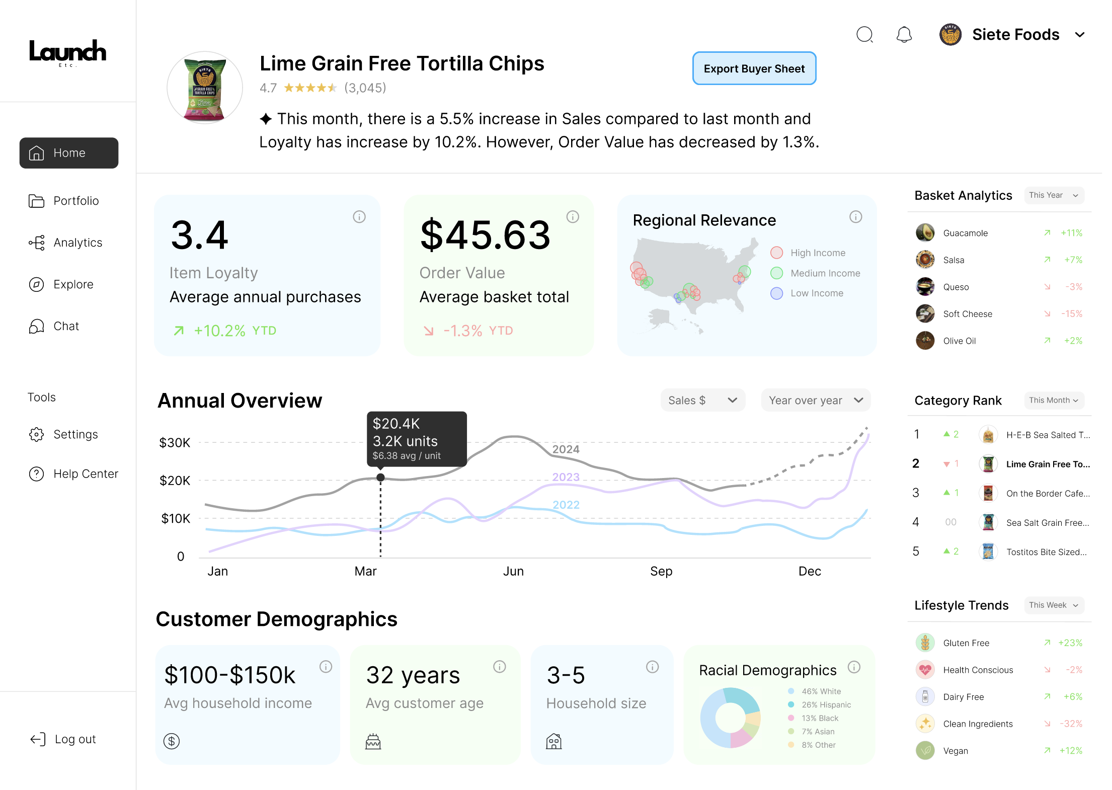
Primary Goal: Design a simple, aesthetically pleasing dashboard to help brands present key metrics to grocery buyers, enhancing their ability to make data-driven sales pitches.
Target Users:
Brands: Use the dashboard to better understand their sales and market positioning.
Buyers: Need clear, digestible data to make informed decisions.
Key Data Insights:
Sales Volume: $ sold, units sold, and supplier reliability.
Household Demographics: Income, age, household size, and regional relevance for targeted marketing.
Competitor Analysis: Market share, category rank, and market penetration.
Basket Data: Insights into product bundling and cross-sell opportunities.
Loyalty Metrics: Repeat purchase behaviors and trends.
Trends: Consumer preferences and emerging product categories.
Promotional Strategy: The dashboard should enable brands to align promotions with basket data for strategic upselling opportunities.
Challenges:
Simplifying data visualization to ensure usability for non-technical users.
Avoiding a steep learning curve, as overly complex dashboards risk deterring adoption.
Addressing buyer skepticism by presenting reliable and intuitive metrics.
Design Requirements:
Clean, monochromatic light theme with shades of blue.
Rounded corners and a maximum of three main colors for clarity.
Modules for sales, demographics, competitor analysis, and basket data.
Export functionality for creating one-page PDF summaries.
Deliverables:
High-fidelity Figma prototype.
A 30-second video demo showcasing the dashboard’s functionality, emphasizing simplicity and ease of use.
This meeting established a clear direction for the project, with a focus on creating an intuitive and visually engaging tool to meet both brand and buyer needs.

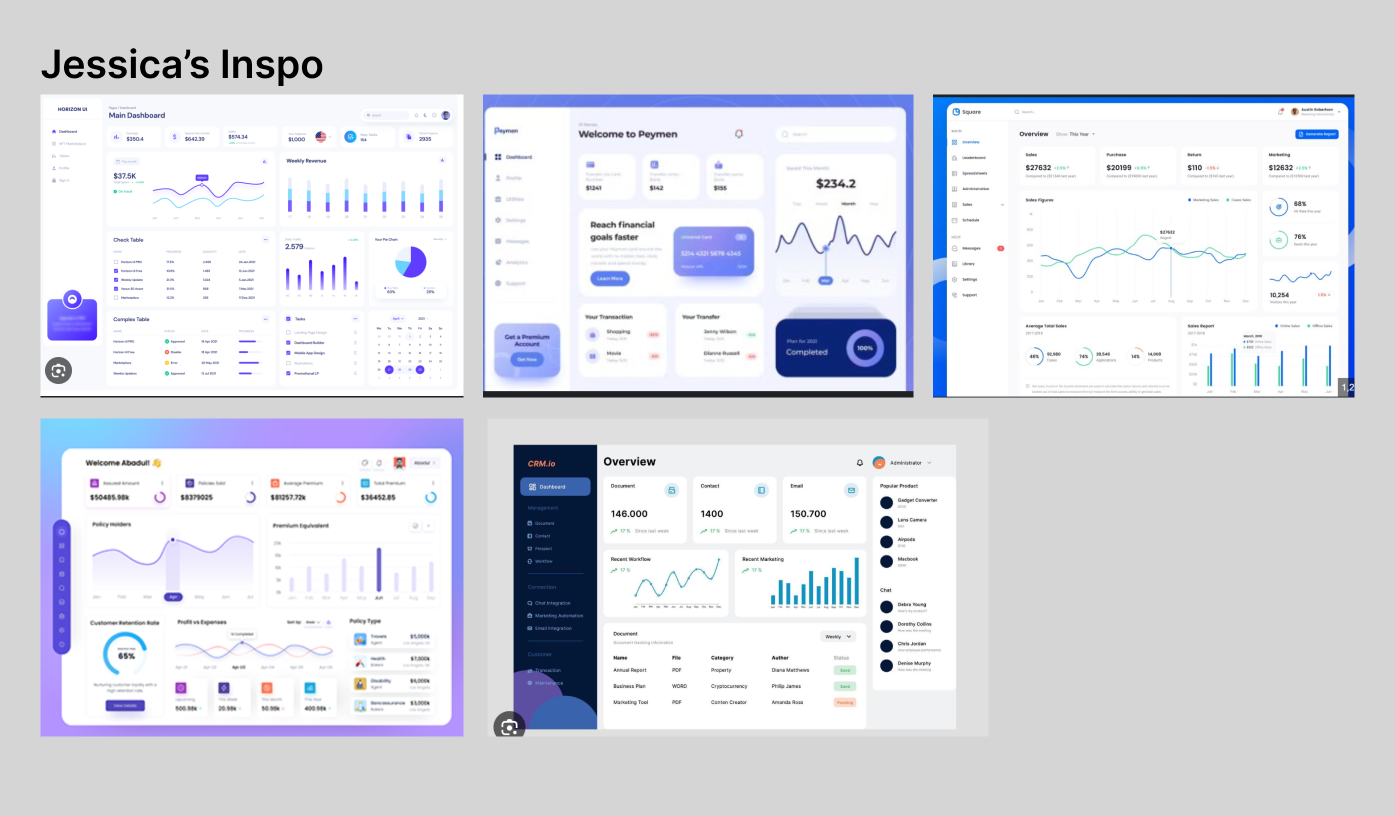
Client’s Vision
One of the founders, Jessica, sent me over some images of her vision for the dashboard. I saved these to my Figma planning file.
Competitor Research
There were a few key competitors in the same industry Launch Etc:
Numerator: A consumer insights and data platform specializing in real-time purchase behavior and demographic analytics for brands and retailers.
Tableau: A leading data visualization software that empowers users to create interactive, shareable dashboards with advanced analytics and visual storytelling capabilities.
Power BI: Microsoft’s business analytics tool designed to visualize data, share insights, and create immersive reports for informed decision-making.
Note: Although Power BI is not a direct competitor to Launch Etc, they have a great dashboard for data presentation.


Desired Features

During the Discovery Meeting, the client described several desired features. I sought out design inspiration for each of these features and organized them into my Figma planning file.
Low-Fidelity Prototype
Starting with the Layout
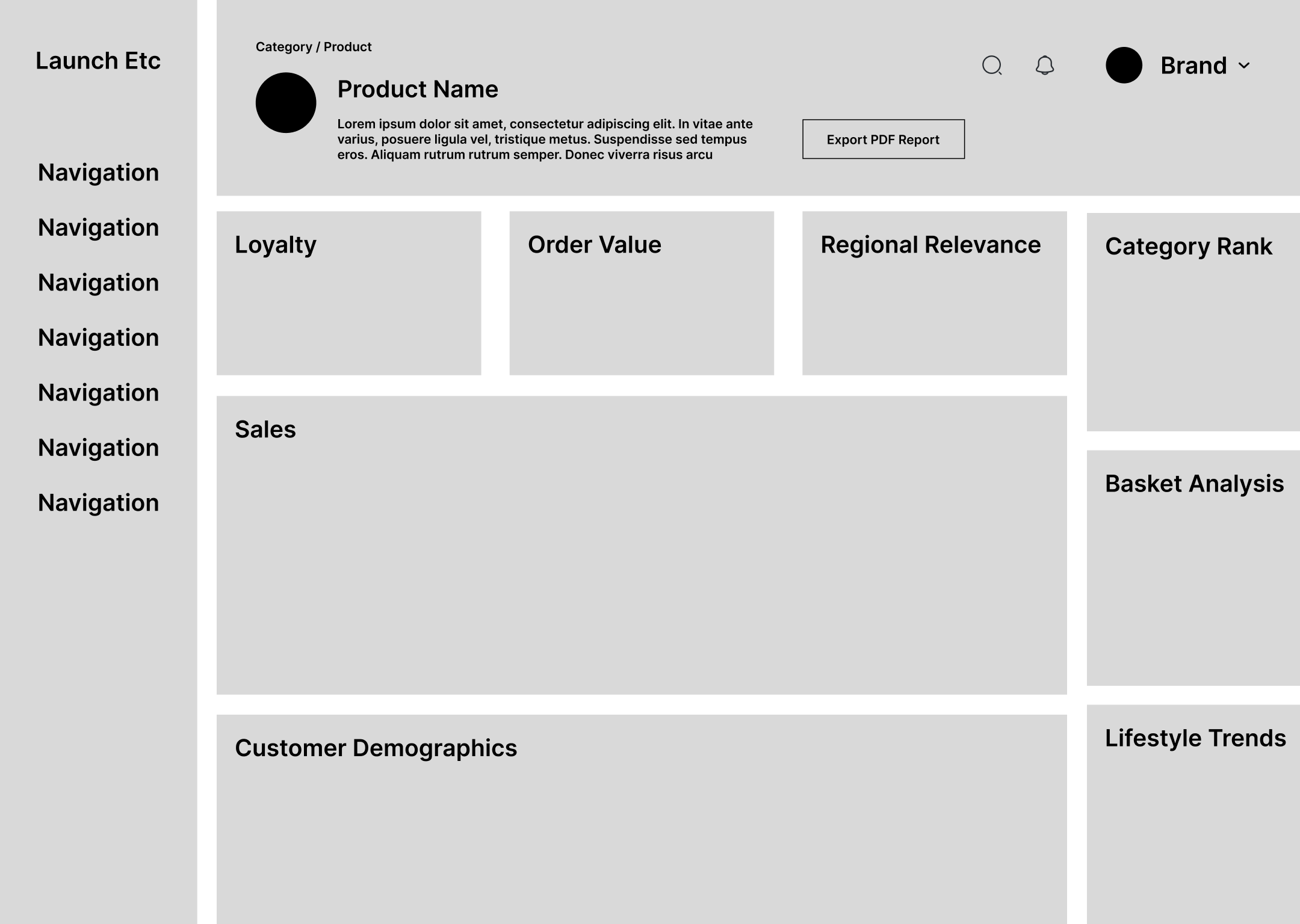
Before creating a prototype in Figma, a general layout was created for the dashboard. Then, the individual cells would be filled in with the corresponding designs, inspired by the Desired Features research gathered during planning.

Final Solution
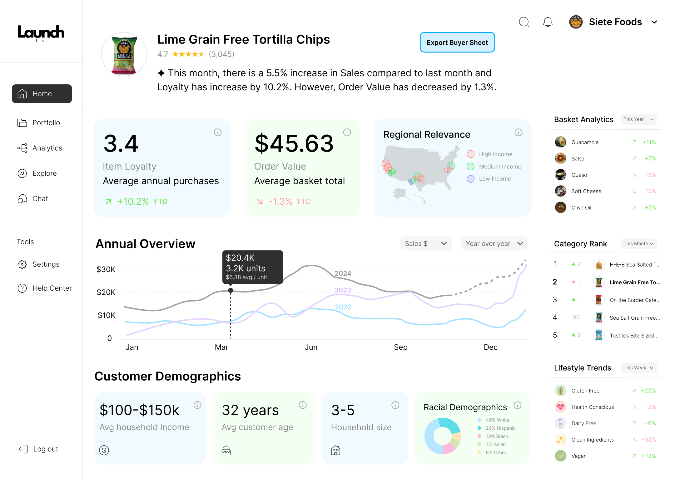
After a few rounds of revisions, the final design was created!
