

Usability assessment of grocery website
Analyzing the website to uncover points of low usability

Responsibilities
User Experience Researcher
Timeline
January 2024 - May 2024
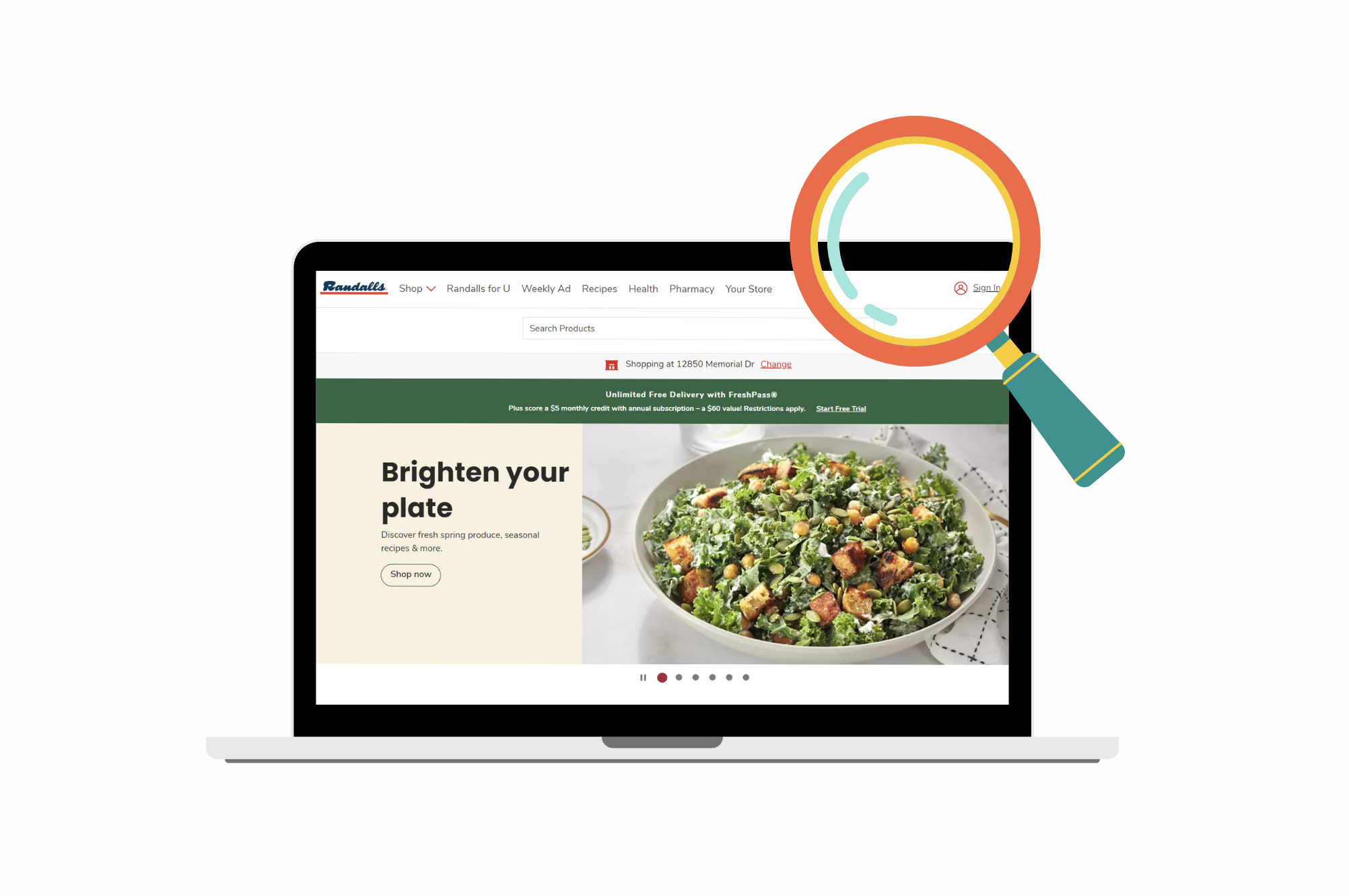
Randalls is a Texas-based supermarket chain with 32 locations. The grocery store has a website that allows users to:
Browse and shop for groceries
Schedule pharmaceutical appointments
Find information about nearby stores
Find recipes
Apply eligible coupons to their purchases
Overview

Usability Goals
Our goal was to analyze the usability of the Randalls site.
Utilizing a series of formative assessments
Wanted to answer these high-level questions. Can users...
Complete their browsing goals?
Complete their online shopping goals?
Access other grocery-related tools (store location, coupons, etc.)?
Randall’s Site Users
Based on our research, we found these typical characteristic for a Randalls site user.


Usability Assessment Participants
There were a few key differences between the typical Randalls site user and the study participants:
All participants were actively enrolled at Rice University, making them a higher SES than the average Randalls site visitor
All were advanced English speakers
The age of the participants was limited to 20-23 years old
Only 50% of participants were originally from Texas
All participants were highly technologically proficient

Heuristic Analysis
Using Niesel-Scheinderman 14 as the set of heuristics, we determined the most frequent and severe heuristics violated by the Randalls site
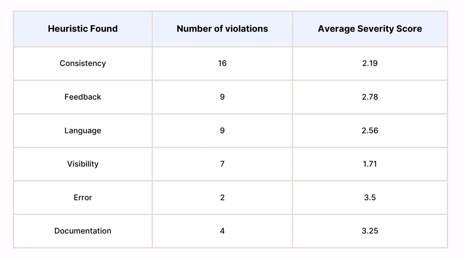
The results of this analysis indicate that Consistency is the most violated heuristic on the Randalls site. Feedback and Language are also heuristics that were frequently violated.
A Cognitive Walkthrough (CWT) was conducted on the Randalls website to assess its usability. Key findings revealed that 71.4% of the tasks were successfully completed, with clear guidance and feedback to users. However, 14.3% of tasks were flagged as "Maybe" for the likelihood of success, and 14.3% as "No" highlighting areas for improvement.
Cognitive Walkthrough
Key Issues Identified:
Pharmacy Section: The Pharmacy website uses a different UI from the main site, leading to confusion. Elements like the “Sign Up” button are placed in unintuitive locations, and the lack of clear branding raises questions about whether users are still on the Randalls site.
Store Location Selection: The process for selecting and viewing store details is confusing. The homepage has limited information, and more detailed store information is hidden under an obscure icon.
Coupon Navigation: The site offers two similar options—“Weekly Ad” and “Randalls for U”—causing confusion about where to access coupons. The different interfaces between these sections add to user frustration.
Inconsistent Interfaces: Many subpages have different layouts, creating a lack of cohesion across the website.
We determined that all of the tasks that failed the CWT were high-probability tasks and, therefore, should be included in the usability assessment.
Usability Assessment: Methodology
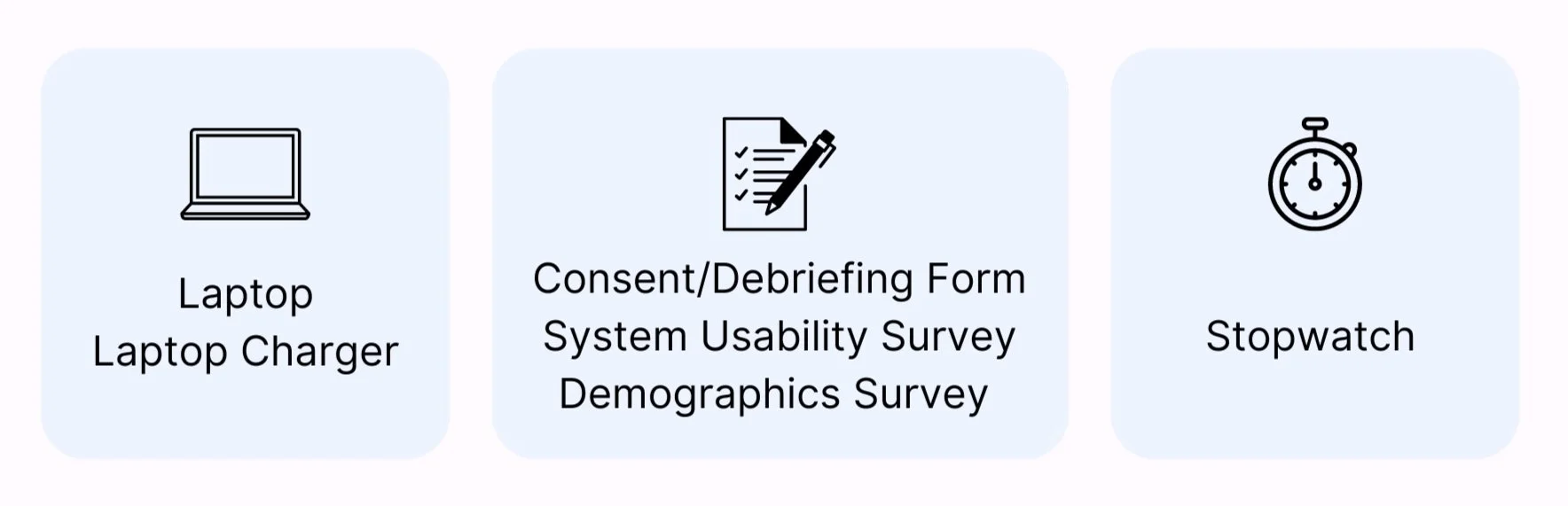
Equipment
The participants will complete the usability assessment on a laptop.
Before the assessment, they will receive a consent form and fill out a demographics survery. After the assessment, they will receive a debriefing form.
During the assessment, participants will complete a System Usability Survey (SUS) for each task.
A usability test administrator will use a stopwatch to time their task completion.
Participants were given 12 tasks to complete, and all participants completed them in the same order.
Here is a general idea of each task:
Navigate to Randalls site
Explore a vegetarian recipe
Login to Randalls account
Determine the closest Randalls store and set it as the pick-up location + pick-up time
Find the opening/closing hours of the closest grocery store near you
Add apples to cart
Apply a specified coupon to cart
Remove items from cart
Locate pickles without using the search bar
Find the “place an order” button
Log into Pharmacy account
Schedule a COVID-19 vaccine appointment by finding the form
Task List

Test Plan
Presentation of the Tasks
Participants will receive a printout of the task list with false Randalls Account login info.
Timing and Stopping Criteria:
Start - Timing for each task begins when participants indicate they are starting the task.
End - Timing ends when the participant indicates they are done.
Time Limit - Time is called at 5 minutes if they cannot complete.
Measuring Task Success:
Success - Completion of pre-established success condition was considered total success.
Errors - Obvious errors of commission, omission, and sequence errors were accounted for.

Usability Assessment: Results
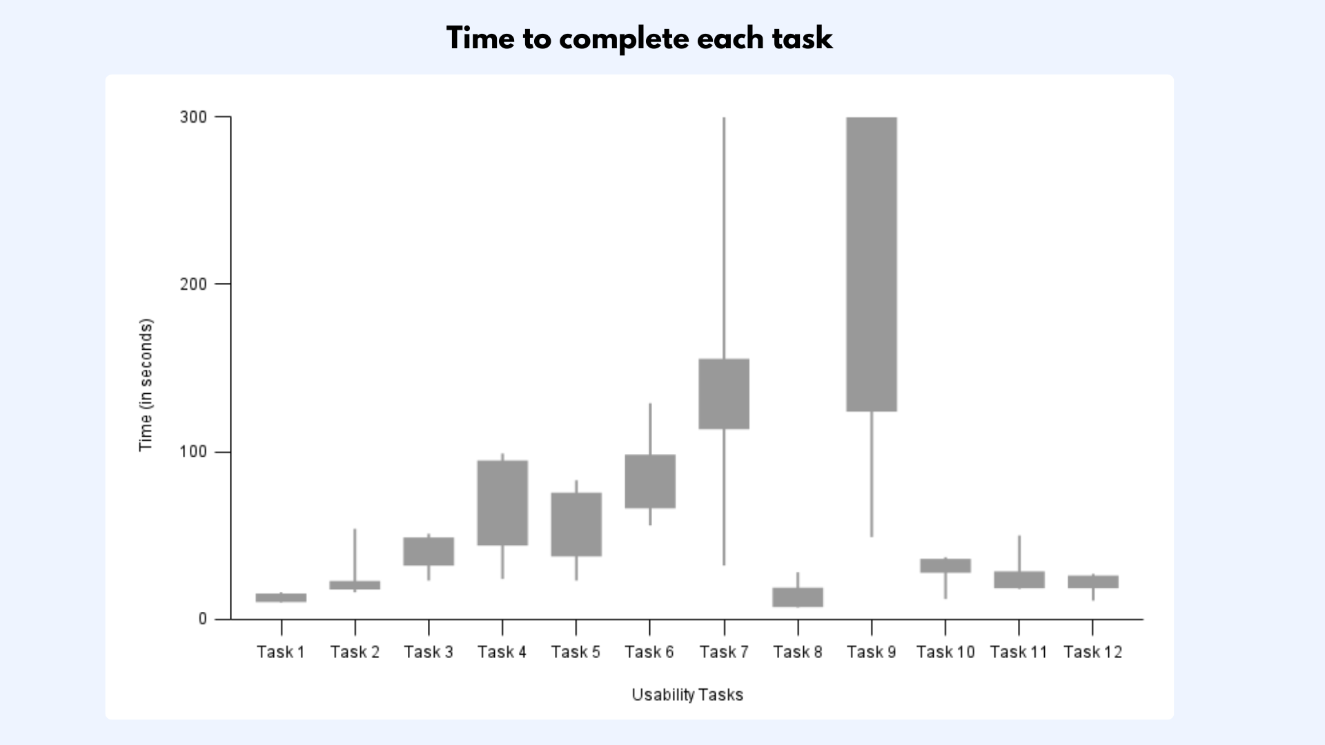
Efficiency
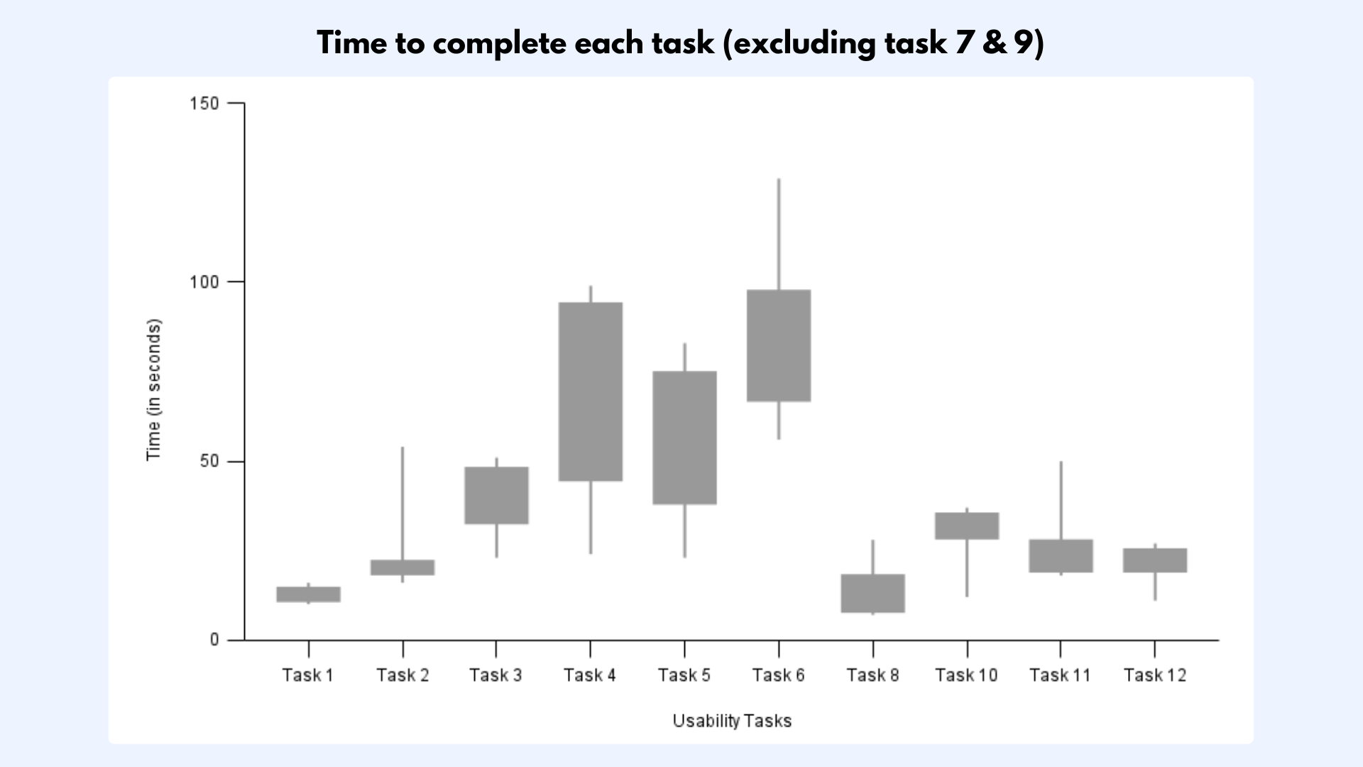
On average, the time to complete each task was ~1 minute.
Finding and applying coupons (Task 7) and Finding pickles without the search bar (Task 9) had unusually long completion times compared to other tasks
Finding and applying coupons (Task 7): ~1 min and 21 sec; 1 participants took longer than 5 minutes and had to be cut off
Finding pickles without the search bar (Task 9): ~3 min and 37 sec; 3 participants took longer than 5 minutes and had to be cut off
To display the data without these outlier tasks, the following boxplot was created.
High Effectiveness
These tasks had 0 errors across all 6 participants:
Task 1: Navigate to Randalls site
Task 8: Remove items from cart
Task 11: Login to Pharmacy account
Task 12: Locate COVID-19 vaccine scheduling form
Low Effectiveness
Task 7: Find a coupon and apply it to the cart
2nd most errors by far
Correct: Click “Randalls for U”
All incorrect participants did: “Weekly Ad” which had non-clippable coupons (just a PDF of the physical coupon book)
Conclusions:
Coupons are un-intuitively stored under “Randalls for U”
Verifying coupon applied could be clearer
Task 9: Locate pickles without search bar
Most errors by far
Many participants gave up
Correct: “Condiments, Spice, & Bake”
All incorrect participants did: “Canned Goods & Soup” -> “Canned Vegetables”
Conclusion: Pickled goods are not categorized intuitively on the website

Effectiveness
To potentially observe usability and satisfaction with the website for each task, participants were provided with the system usability scale survey.
Individual SUS scores were generally positive and, based on reference scores, were deemed acceptable.
Overall SUS score was excellent: Mean SUS score = 85.04
Satisfaction (SUS)

Conclusion & Recommendations
Overall, we noticed that the main issues affecting users was unclear wording and duplicate content within the site. The menu labels “Weekly Ad” and “Randalls for U” confused many users who were trying apply coupons.
Therefore, we recommend that Randalls rework a page to focus on coupons and avoid using vague terminology. Additionally, Randalls should verify that all buttons have appropriate feedback. Finally, Randalls should create more cohesive and intuitive grocery categories.
While the interface inconsistency in UI between the Grocery and Pharmacy sites did not seem to affect website effectiveness, we still recommend that Randalls maintain consistency between pages.
Rice University. (2023). Rice University: Class of 2027 Profile. Office of Admissions at Rice University. https://admission.rice.edu/apply/class-profile
Rubin, J., & Chisnell, D. (2008). Handbook of Usability Testing: How To Plan, Design, and Conduct Effective Tests. Wiley.
Wang, J., & Geng, L. (2019). Effects of Socioeconomic Status on Physical and Psychological Health: Lifestyle as a Mediator. International journal of environmental research and public health, 16(2), 281. https://doi.org/10.3390/ijerph16020281